Nostalgia: a sentimental longing or wistful affection for the past, typically for a period or place with happy personal associations.
A yearning for a rose-colored, romanticized past permeates cultures across the world, and, in particular, in the United States. We hear the longing in slogans, see the interest and selling power in cinematic franchises, theatrical reboots, revived television series, cylical fashion fads, generous music sampling, and a classic video games renaissance.
And, over the past decade or so, nostalgia has found a home in the world of sports logos. Across the four major professional sports leagues—MLB, NFL, NBA, and NHL—seeking inspiration from the past or resurrecting bygone era logos has become an underreported but active cottage industry.
Let’s start with the NBA. At least six of the existing 30 franchises have either reverted wholly to logos of yesteryear or significantly extracted elements from classic logos for their current franchise symbols.
This is the third of six articles highlighting each of the six NBA franchises that returned class logos. Then, I will illuminate the revivals in MLB, NFL, and most voluminously, in the NHL.
The Sacramento Kings
Bob Grove was not asked, was not hired, and never received a check.
But, his unsolicited submission became an icon.
ORIGINS
The Sacramento Kings were organized in 1923 by Les Harrison—a recent high school graduate who starred at the upstate New York city’s East High School—as the Rochester Seagrams, a semi-professional basketball club funded by the local Seagram and Eber Brothers’ distilleries. For the next two decades, with Harrison calling the shots on the court and in the front office, the club—often split into two teams—plied the independent cage circuit in the northeast United States.
In the mid-1940s, the National Basketball League (NBL) was looking to expand eastward from its Midwest-centric roots. Rochester was appealing and Harrison was listening.
However, Seagrams and the Eber Brothers were not.
“My brother and I mortgaged everything we could lay our hands on and we got a franchise…I think it was $25,000,” Harrison recalled in an article in Rochester History published by the Rochester Public Library.
Harrison was in the NBL, but, this time without sponsors. A one man show—coach general manager, owner—Harrison, unlike other NBL owners, had no other outside financial interests. The financial risk was his and his brother’s only.
Seeking a fresh identity, a city-wide competition was launched to name the team. In his winning essay, 15-year Richard Paeth recommended the name Royals because “what could be more fitting than this as a name for the team Les Harrison is going to send out to bring the crown to Rochester?”
The Royals—featuring future Hall of Fame quarterback Otto Graham and subsequent Hollywood legend Chuck Connors (Rifleman, Branded)—made Paeth look prescient, capturing the the league title in their first season in the NBL, sweeping Sheboygan in the best of five championship series.
COMPETITION EMERGES
Unlike the NBL, which featured marginally affluent owners managing tight budgets in compact facilities in smaller cities, the Basketball Association of America (BAA) was founded by wealthy arena owners in larger metropolitan areas seeking entertainment options for customers on non-hockey, non-ice show dates. Boston, Philadelphia, New York, Providence, Baltimore, Chicago, St. Louis and Washington D.C. comprised the initial 1947-1948 season for the fledgling association.
While the BAA had capital, the newly-founded league lacked on-court talent. That, the NBL had. Overtures were made to NBL clubs. Indianapolis and Fort Wayne jumped at the lure of larger arenas, enhanced revenue, and increased exposure. Soon, Minneapolis and Harrison’s Royals followed. By the 1949-1950 season, the merger was complete—the National Basketball Association (NBA) was born.
While the team’s fortunes on the court peaked with the NBA title in 1950-1951 (sadly, the franchise’s only crown), the team struggled at the box office. The migration of affluent residents to the surrounding suburbs, stagnation in median income for the city, and the growth of television all played roles in the eventual departure of the team.
“We played Tuesdays and Saturdays opposite Milton Berle and Imogene Coca. Attendance went down after our title year. It was just a matter of time before we had to give up,” complained Harrison.
Five years after winning the league title, Harrison vented his frustration in a newspaper interview. “We blew about $30,000 this year (actually $25,0000)…I am a businessman. I have to operate the same as a man running a department store. My franchise is worth $100,000 as such. I have lost $140,000 the five years in basketball. To sell, I need $240,000 to get even…This is my hometown and I would take less money from a local group than from an outside interest…I operated in the Sports Arena, which was a glorified warehouse…everybody thought the new building would be the happy answer. What happened? The bowling (ABC) moved us out last season. This season all we see is ice (due to the Rochester Americans hockey team).”
The time had come to move.
From a Harrison statement: “From a survey made, it was evident that the trend of the National Basketball Association is toward larger, major-league cities, with a potential draw of appoximately one-and-a-half to two million people. In addition, it is necessary to include in the successful operation of a team, the radio and TV financial market. The city of Rochester, with its excellent facilities, and attractiveness, however, failed to come with the scope of these qualifications.”
Encouraged by a suggestion from star player, Jack Twyman, on April 4, 1957, the Cincinnati Royals were christened as the next generation of the Rochester Royals.
Needing a new logo in his new home, Harrison turned to Harold Russell, who designed the Reds’ Mr Redlegs logo in 1953 (yes, the Reds changed their name to Redlegs—Joseph McCarthy’s Red Scare was at a fever pitch in the early 1950s).
The Cincinnati Enquirer cartoonist returned a smiling face on a basketball with the city’s skyline as the crown laid on a map of the United States in blue and white. Introduced in August 1957, perhaps, not surprisingly, the face bore a striking resemblance to Mr. Redlegs.
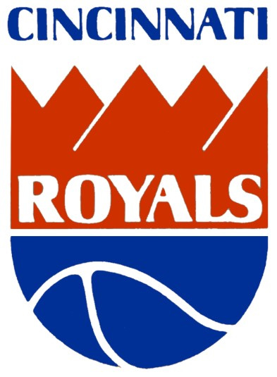
The logo lasted until 1971—and three sets of owners after Harrison sold the team to Thomas Wood in 1958 after a deal with Ned Shapiro (who wanted to return the team to Rochester) was nixed by the NBA— when a 24-year old recent college graduate determined that the local basketball franchise needed a new logo.
“It was totally unsolicited. They didn't ask me to do it, and I don't think they were even interested in a new design at that time, “ Grove told Paul Lukas for a UniWatch article on espn.com in 2016.
“I had worked with a local design studio in Cincinnati. But it was a very closely held studio, and I didn't see myself going very far there. So I was about to start out on my own, and I thought maybe I could get some clients by doing some stuff on speculation. A friend of mine had just gotten some work designing the logo for a new minor league hockey team, so I thought about the Royals. Back then their logo was this "Mr. Basketball" guy, and I thought, "How can I go wrong? I know I can do better than that."
“So I did it purely on spec, with the idea of getting some more work. Somehow, I knew the guy who was the Royals' head of PR at the time, so I submitted it through him.”
Surprisingly, the unsolicited logo became the new Cincinnati Royals’ logo.
“We believe this new signature portrays the chracter of our organization much better,” offered Joe Axelson, the Royals’ general manager in the announcement unveiling.
In crafting the new logo, in a Lima News article in 1971, Grove noted, “The five points in the crown represent the five starting players, Initially, I thought the old symbol needed to be redone quite a bit.”
Grove’s compensation? “Basically, they just gave me a couple of season tickets for what turned out to be their last year in Cincinnati. I did go to several games with those tickets.”
Any more work from the Royals? “Not at all. Of course, that might have happened at some point down the road if they had stayed in Cincinnati, but instead they moved the team to Kansas City. And, of course, I was disappointed—I was hoping, maybe, in the next season, to get more work from them and implement the logo idea more fully as a branding kind of thing. Back in those days we called it identity, not branding. But anyway, yeah, I never got the chance to cultivate them as a client.”
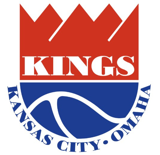
When the Royals moved to Kansas City and Omaha in 1972, the logo traveled west with the team.
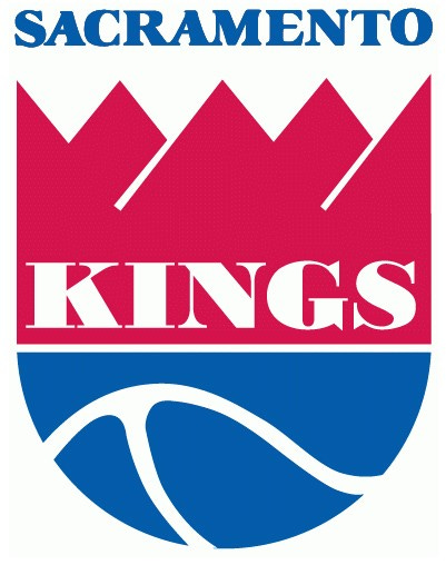
When the Royals continued their westward migration to Sacramento in 1985, the logo traveled west with the team.
In 1990, Commissioner David Stern hired Tom O’Grady as the NBA’s first Creative Director and over a five year period, the logos and branding of 20 of the 30 NBA teams’ were modernnized to try to appeal to a changing marketing demographic.
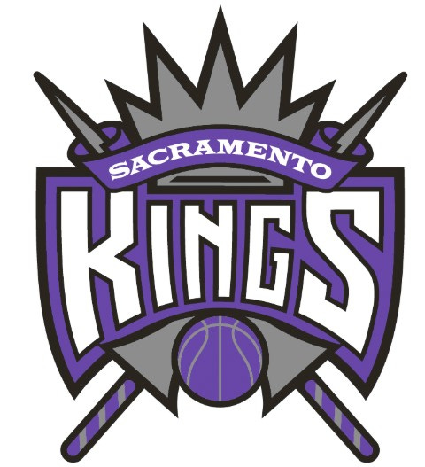
In 1995, the Kings’ unveiled a radical reworking of their logo.
The colors? “The Kings liked the Colorado Rockies color scheme – their sales were very, very strong from the start,” says O’Grady.
The focus? Ornate shields, crowns, and armor style graphics.
The first prototype? Too edgy.
“We had short, blunt swords in the original design,” says O’Grady. “They were almost like warrior swords you’d see the gladiators with – they weren’t the elongated lances that you see in the (final) logo.
“The swords were much tougher looking, but it was agreed that they were simply too aggressive.
“As I recall, fans almost uniformly embraced the change – the old logo, while charming, was dated and lacked the sophisticated look of the new identity,” says O’Grady.
Well, for about twenty years.
“I think we all kept coming back because instinctively, it just felt right,” explains Rodney Richardson, formerly lead designer for Nike’s Global Basketball division about the 2016 return to the original logo concept. “This identity symbolizes the founding principles of this organization, of grassroots authenticity, of a passion for success. It represents, at the highest level and the cleanest level, who they are and the game they play. ‘The kings of basketball’ – you cannot say that any simpler than that mark does. So why force it? It’s like we were trying hard to push it aside (thinking), ‘We can’t just go there because it’s there,’ (when) it does everything that we determined this mark needs to do for this team, this city, and it brings with it, deep, deep roots. Who can ask for more?”
“Our (former) logo became so much about the fight (to keep the Kings) – it has lances and it’s sort of in this medieval kingly state, which was very true to that feeling of fighting for the team,” says Kings Chief Marketing Officer Ben Gumpert. “But now we’re moving forward, there is positivity and there’s a sense of new hope for the region. We asked, ‘How can we better capture that emotion in a brand that stands for everything we now represent and everything we want to represent going forward?’”
Amazingly, at the time of the retro logo design in 2016, the Sacramento Kings did not know about Bob Grove. The lifetime graphic designer, though, is humble about the resurgence of his original unsolicited submission.
"It's all very unusual and unexpected. But it's very gratifying.
“Obviously, if a lot of people have seen it, it's had a big impact, and that's somewhat validating. The most rewarding aspect of it is that it's stayed alive so long. Sometimes, you do good work and it disappears within a year or two.”
The three point field goal and one?
The Royals/Kings’ logo is not Grove’s only lasting impression. That deck of UNO cards? Yeah, that is Grove’s design, too. And, he was paid for that one.
-30-


never understood why purple wasn't part of the logo for a long time, it being a royal color and all...
Another nice piece of history. I was too young to remember the Rochester Royals, but I was a big fan of Oscar Robertson's Cincinnati Royals.